In the chaos of the professional world, juggling time can feel like a real circus act. Cirque contre la Montre brings an innovative approach to time management and human resources — where every minute counts and every talent is valued.
/customer/
Le Cirque contre la Montre
/sector/
Human resources
/Main Service/
Brand identity
/customer/
Le Cirque contre la Montre
/Main Service/
Brand identity
/Industry/
Human resources
The mandate
Description
Our approach
Our mission was to capture the very essence of the circus while infusing it with a modern, dynamic touch. It all began with a logo that evokes both the thrill of the show and the precision of passing time. Every graphic element was carefully crafted to deliver a memorable visual experience.
We explored a bold yet harmonious color palette, inspired by the vibrant hues of the traditional circus while bringing a modern twist. Warm and captivating, these colors spark curiosity and a sense of adventure.
Typography was another key element in shaping the visual mood. We chose fonts that are both contemporary and slightly retro — evoking circus nostalgia while staying firmly rooted in the present.
Designing the visual identity for Cirque contre la Montre was a captivating challenge. The goal was to capture the delicate balance between time pressure and the celebration of talent. A project where every detail matters — just like their philosophy.
Alexandre Biguet - Graphic designer
/Our achievements
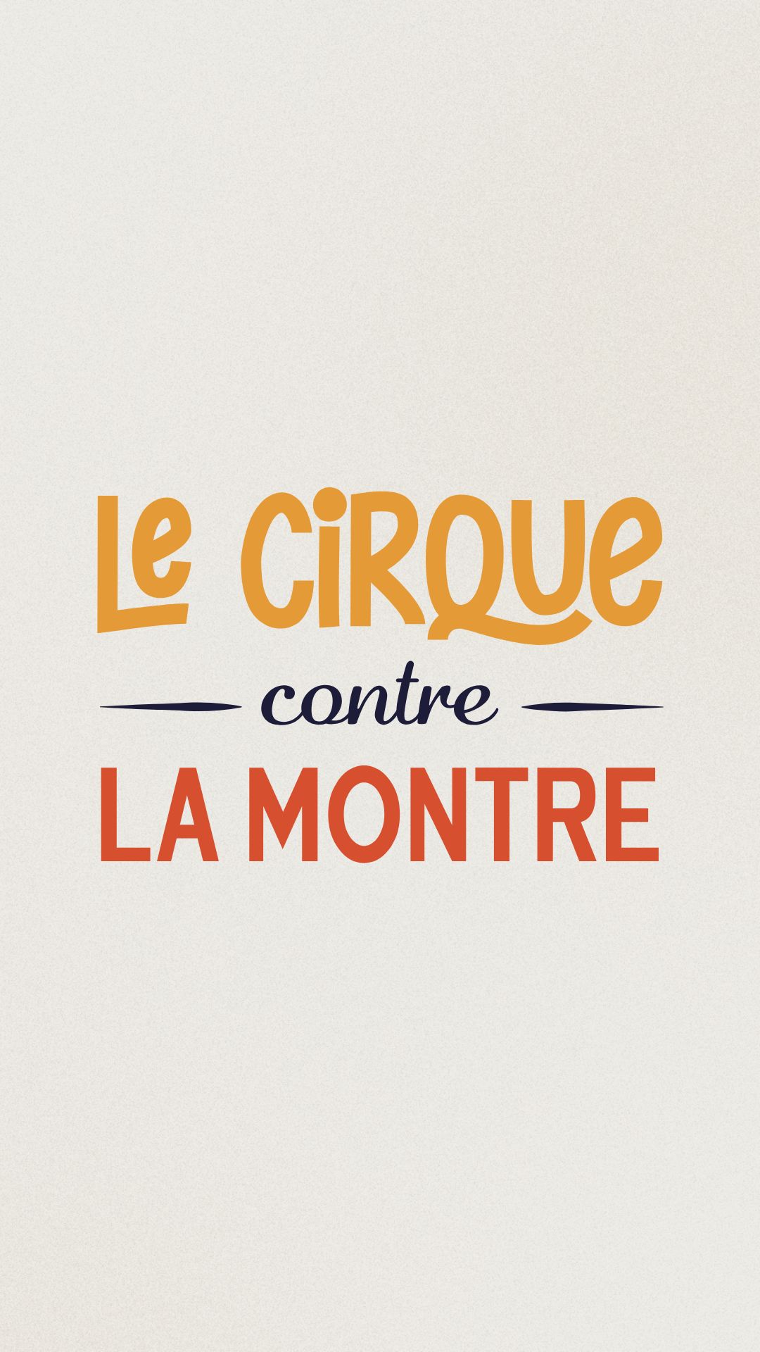
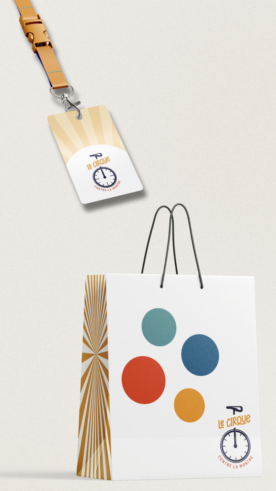
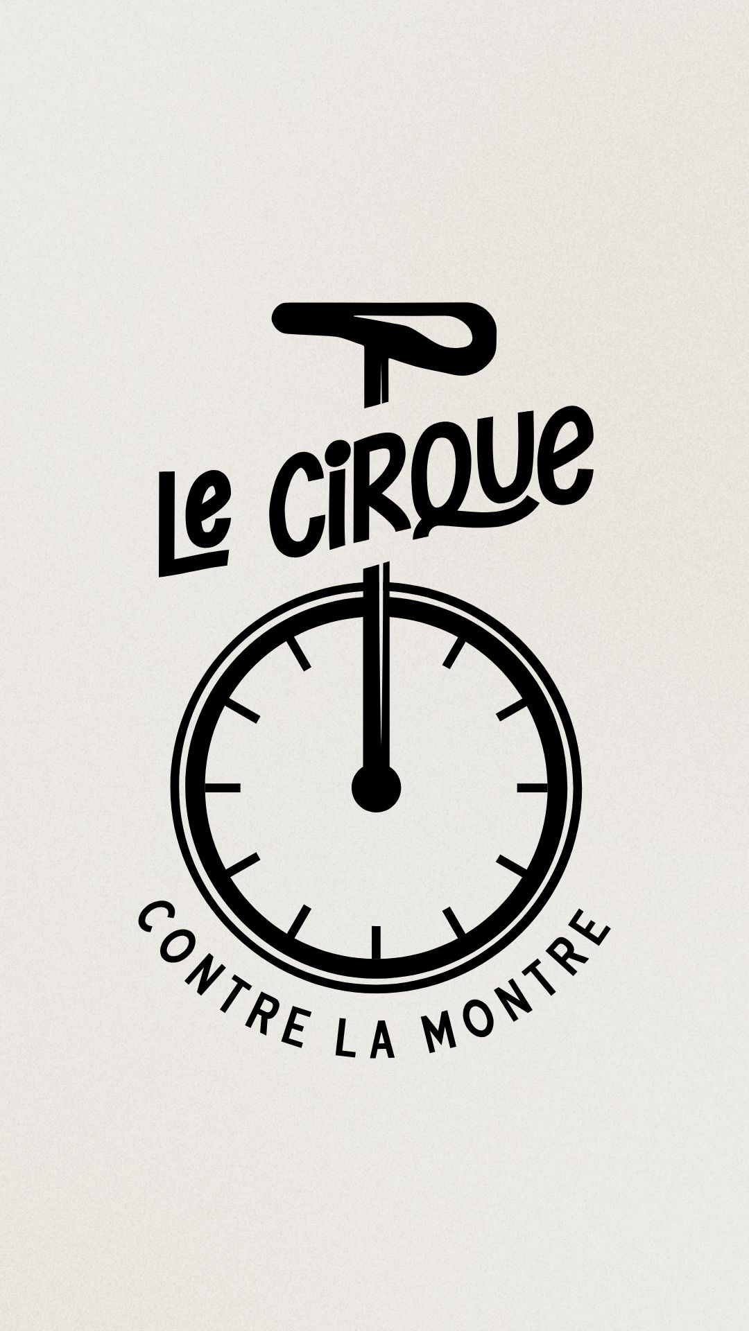
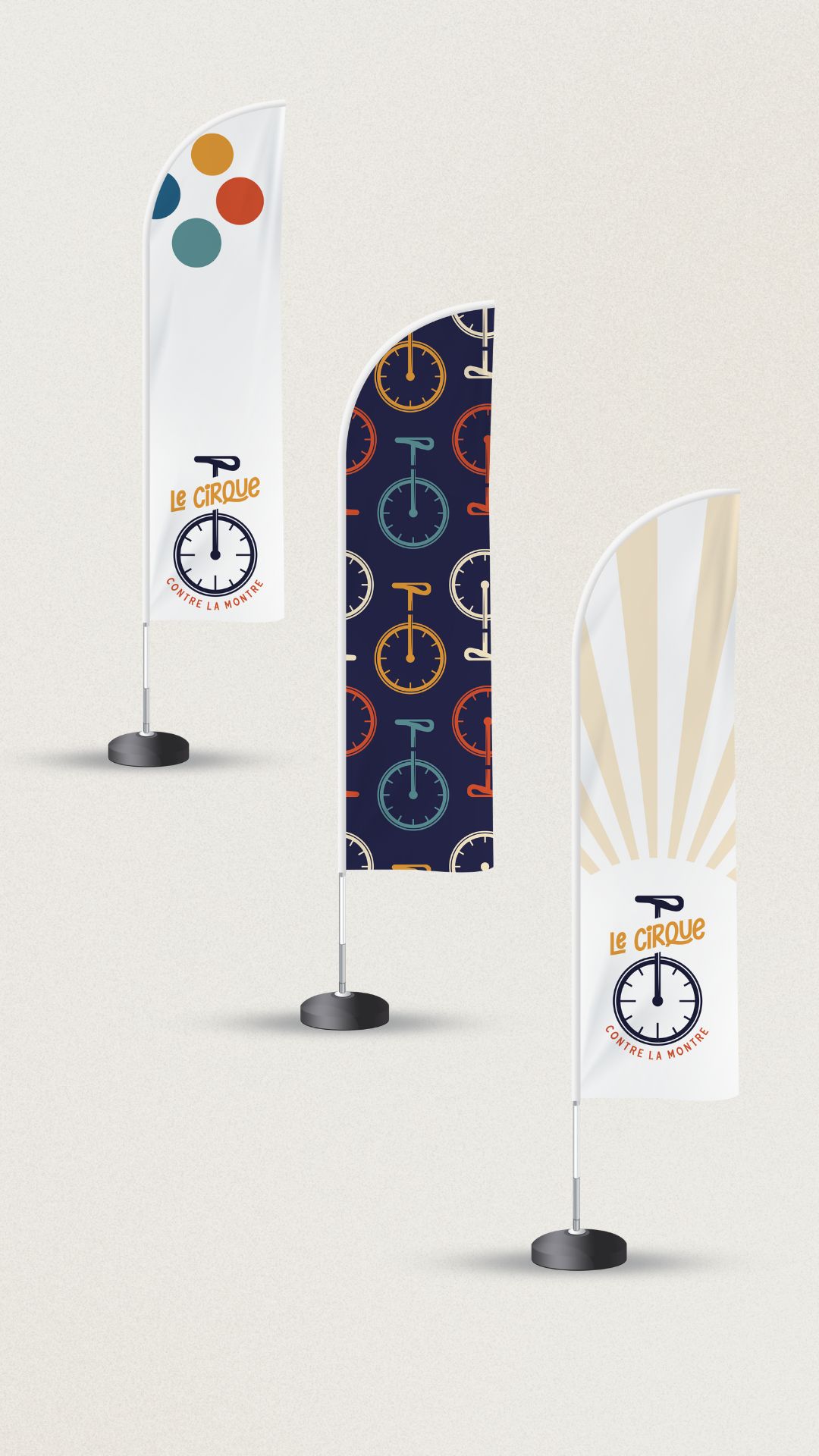
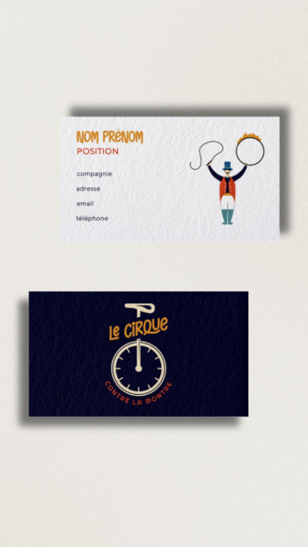
A brand image that evokes professionalism, dynamism and inventiveness all at once. It's both a visual and emotional experience, and our aim was to ensure that the brand image reflected this exceptional dimension of human resources.